Python Geographic Plotting
G’day everyone! The topic of this post focuses on geography related plotting strategies. Specifically, I’m going to show you how to get started making your own beautiful visualizations in Python so you can avoid the methods that require heftier buy-in like D3 or some dashboarding toolkits. This post is going to loosely follow this excellent guide.
There’s no shortage of interesting data visualizations showing the ranking or distribution of some metric across the United States. More than that, there’s no shortage of freely available data anyone can use to make compelling visualizations. FiveThirtyEight and Redfin often have some rather aesthetic visualizations revealing insights into nationwide data and trends, the US Census has interesting datasets, and Free GIS Data also has a TON of geographic datasets. Pick one that looks interesting if you’re following along.
Our main interface for handling geographic data is going to be geopandas. This library provides a Pandas-like interface to working with geographic data; it wraps the necessary lower level libraries (GEOS, GDAL, and PROJ) so we can do powerful manipulations with just a little bit of Python.
Installing⌗
The official docs recommend using conda but if you’d rather just pip install, here’s what I did using pyenv and it “just worked” (you’ll need to install whatever other packages you want to use as well, but this will get your geopandas smoke tests passing):
pyenv virtualenv 3.9.1 geodemo
pyenv activate geodemo
pip install --upgrade pip
pip install geopandas
Note that this may not work for Windows; if you’re developing on a Windows machine, you probably already have coping strategies for package installation.
Reading Data⌗
You can load pretty much anything with geopandas.read_file. You can give it a path (including URLs) and it should Do The Right Thing. Under the hood it uses fiona, so if you need to debug anything, you’ll probably want to get familiar with the fiona interface.
If you’ve installed everything, then try:
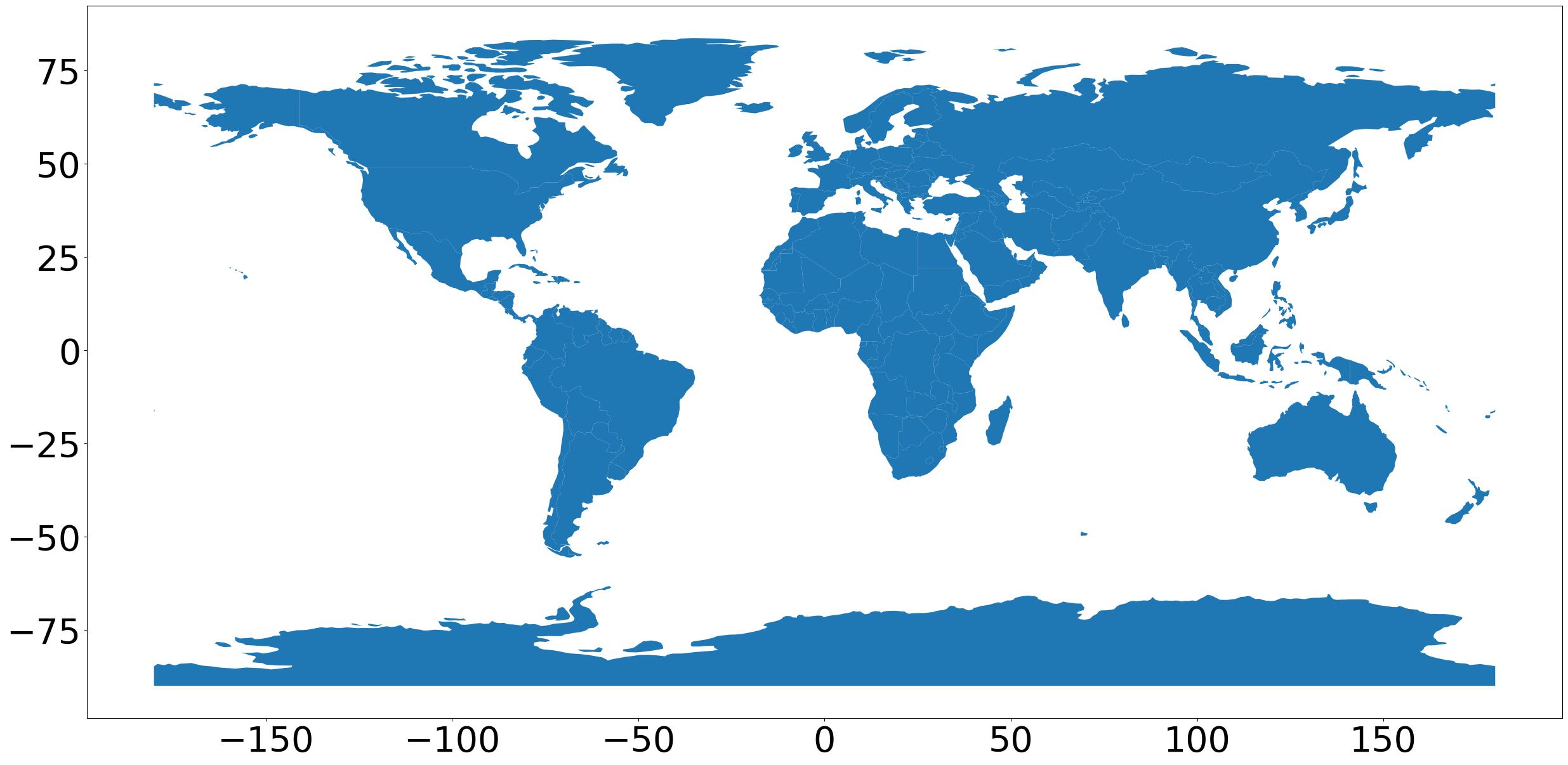
import geopandas
gdf = geopandas.read_file(
    geopandas.datasets.get_path("naturalearth_lowres"))
gdf.plot()
and you should see a (projected) world map:
Saving Figures⌗
The call to gdf.plot() returns a matplotlib axes instance. You can grab the figure from that and call savefig like gdf.plot().figure.savefig("out.jpeg"), or if you’d like to have more control over the figure, then you probably want to do something like the following:
fig, ax = plt.subplots(figsize=(30,18))
gdf.plot(ax=ax)
for item in ax.get_xticklabels() + ax.get_yticklabels():
    item.set_fontsize(40)
fig.savefig("out.jpeg", bbox_inches="tight")
Handling Data⌗
The standard data structures you’ll be working with are GeoSeries and GeoDataFrame. These are very similar to their Pandas counterparts, with some important enhancements.
A GeoSeries is a vector where each entry in the vector is a set of one or more shapes corresponding to one observation (e.g., Hawaii is a single state or “observation” consisting of many islands or “shapes”). geopandas has three shape primitives (which are Shapely objects under the hood): Points, Lines, and Polygons. The GeoSeries class implements nearly all of the attributes and methods of Shapely objects. See the docs for a comprehensive list, but in short you can do things like get the boundaries, centroids, and perform relationship tests (e.g., is one shape within or intersecting another).
The GeoDataFrame has a notion of an “active geometry”, or just “geometry”. This is a particular GeoSeries that’s the subject of any spatial method applied to the GeoDataFrame. You can access this with gdf.geometry, which has useful attributes like name. You can set the geometry to any spatial column using the set_geometry method. If you rename the geometry column, you need to set the geometry to the new name: gdf = gdf.rename(columns={'old_name': 'new_name'}).set_geometry('new_name'). Note this from the docs: Somewhat confusingly, by default when you use the read_file command, the column containing spatial objects from the file is named “geometry” by default, and will be set as the active geometry column. However, despite using the same term for the name of the column and the name of the special attribute that keeps track of the active column, they are distinct. If you wish to call a column named “geometry”, and a different column is the active geometry column, use gdf[‘geometry’], not gdf.geometry.
Adding Columns, Filtering Data, and Axes Manipulation⌗
You can add computed columns and conditionally filter rows just as you would with vanilla Pandas. In principle when plotting you can just set legend=True in your call to plot(); this is fine for quick-and-dirty plotting but you’ll almost certainly want full control or the legend/colorbar at some point.
If you want, you can follow the docs and leverage mpl_toolkits to do from mpl_toolkits.axes_grid1 import make_axes_locatable and create a colorbar that way. You can also explicitly handle the colorbar like I show below, but note that you do have to do some “manual” stuff like creating the ScalarMappable dependency:
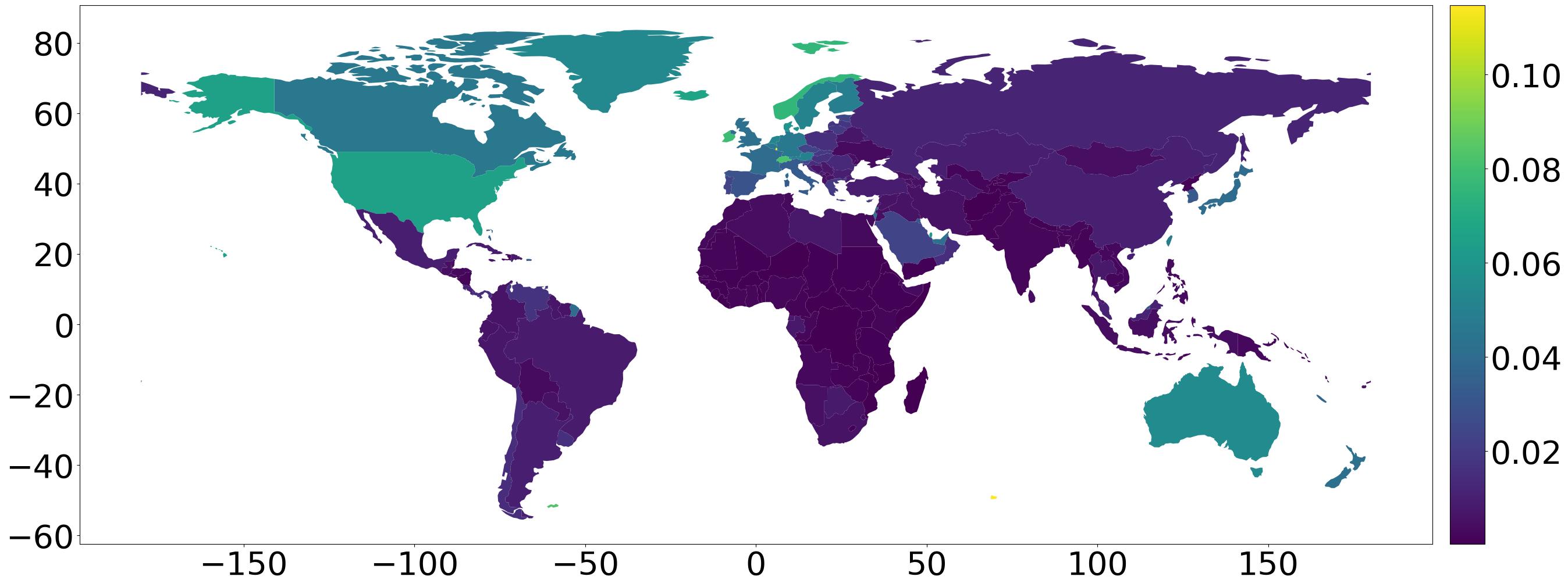
fig, ax = plt.subplots(figsize=(30,18))
gdf_gdp = gdf.copy()
gdf_gdp = gdf_gdp[(gdf_gdp.pop_est>0) & (gdf_gdp.name!="Antarctica")]
gdf_gdp["gdp_per_cap"] = gdf.gdp_md_est / gdf.pop_est
gdf_gdp.plot(ax=ax, column="gdp_per_cap")

# add a colorbar
cax = fig.add_axes([
    ax.get_position().x1+0.01,
    ax.get_position().y0,
    0.02,
    ax.get_position().y1-ax.get_position().y0
])
sm = plt.cm.ScalarMappable(
    cmap=matplotlib.colormaps.get_cmap("viridis"),
    norm=matplotlib.colors.Normalize(
        gdf_gdp["gdp_per_cap"].min(),
        gdf_gdp["gdp_per_cap"].max()
    )
)
fig.colorbar(sm, cax=cax)

# font tweaks
for item in ax.get_xticklabels() + ax.get_yticklabels():
    item.set_fontsize(40)
for item in cax.get_yticklabels():
    item.set_fontsize(40)

# output
fig.savefig("out.jpeg", bbox_inches="tight")
For now, this should be enough to get you rolling. The hard part is done; the rest is just finding a neat data set and referencing the geopandas docs. Until next time!