Observable Plot for Fast EDA

Hello again! I’m really excited for this post; I’m going to be showing off a powerful visualization package called Plot (docs here), which is a JavaScript plotting library that came out of Observable.
First, a little background. D3 is an incredibly powerful visualization toolkit that lets you build visualizations directly in your HTML documents. However, D3 is a relatively low level library, and it can be a bit cumbersome when you just want to make a simple chart. This is where Plot comes in; it provides a more restricted (but still very powerful) API that lets you create D3 plots with just a couple lines of code. If Matplotlib were the D3 of the Python ecosystem, then Plot would be the Seaborn of the JavaScript ecosystem. The best part is that it integrates seamlessly with your frontend framework of choice (in my case, Vue).
Next, you’ll need a dataset to visualize. This can be whatever, but I highly recommend that whatever dataset you use, you wrangle it into “tidy data”, or row-based format, which makes it profoundly easier to work with (this is true in general, but especially when using Plot). In short, this means formatting your data into a list of objects like:
[
  {"hour": 0, "value": 8, "sensor": "A"},
  {"hour": 0, "value": 6, "sensor": "B"},
  {"hour": 1, "value": 7, "sensor": "A"},
  {"hour": 1, "value": 5, "sensor": "B"},
  {"hour": 2, "value": 3, "sensor": "A"},
  {"hour": 2, "value": 0, "sensor": "B"},
  {"hour": 3, "value": 9, "sensor": "A"},
  {"hour": 3, "value": 2, "sensor": "B"}
]
I’m going to use the palmerpenguins dataset, but you can use whatever is convenient (NOTE: I actually had to grab this off of a different server because the original page doesn’t seem to link the raw CSV/JSON :thinking_face:); a JSON version is available here.
Ok, we’ve got our data. Go ahead and install Plot however you want. In principle you can pull this from a CDN, but you can also just install it into your project with whatever package manager you’d like (e.g., yarn add @observablehq/plot).
Now it’s time to write the actual components! I’m going to show how to do this in Vue, but whatever your framework, the steps are pretty similar. First you’ll want a component to encapsulate your plot. This can be called something like SimpleObservablePlot.vue; it might look something like this:
<template>
  <h6>
    Simple Penguin Plot with Observable Plot
  </h6>
  <ObservableFigure :options="options" />
</template>

<script setup>
import * as Plot from "@observablehq/plot";
import ObservableFigure from "@/components/ObservableFigure.js";
import penguins from "@/assets/penguins.json";

const options = {
  marks: [
    Plot.frame(),
    Plot.dot(
      penguins,
      {
        x: "culmen_length_mm",
        y: "culmen_depth_mm",
        stroke: "species",
        fill: "species",
        fy: "sex",
      }
    ),
  ],
  grid: true,
  aspectRatio: 1,
  inset: 10,
  facet: {marginRight: 90},
  fy: {domain: ["MALE", "FEMALE"]},
  x: {tickSpacing: 80, label: "Culmen length (mm)"},
  y: {tickSpacing: 80, label: "Culmen depth (mm)"},
  color: {legend: true},
}
</script>
Next, we need to implement this ObservableFigure.js component. Note that this is using the Render Function. This component might look something like this:
import * as Plot from "@observablehq/plot";
import {h, withDirectives} from "vue";

export default {
  props: ["options"],
  render() {
    const { options } = this;
    return withDirectives(h("div"), [
      [
        {
          mounted(el) {
            el.append(Plot.plot(options));
          }
        }
      ]
    ]);
  }
};
And that’s all folks. You should have a nice plot like this one:
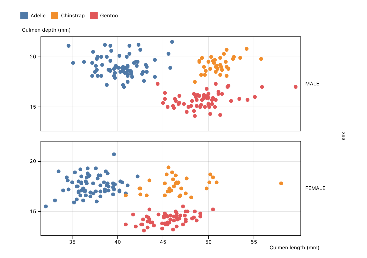
This is actually wild; there’s no fiddling with lower level D3 primitives; you basically put your data in a row based format and give it to Plot and you’ve got a pretty visualization. Boom. It’s much better than that though. While the Plot API is relatively simple, it’s still very powerful. Plot makes it quick and easy to apply all sorts of transformations, aggregations, and faceting to get you to that “EUREKA!” visualization in no time.
On top of all that, the documentation is fantastic to get you up and running, and if you’re unsure about some particular API, it’s all nice clean TypeScript so you can just jump around in your editor and have the API right there in front of you plain as day (this is how I figured out some of the facet options used above…didn’t even have to search StackOverflow :winking_face:). If you do need to confer with the Internet, the Observable platform itself has tons and tons of community submitted snippets and posts (like StackOverflow) and you can test them out right there in the notebooks; it’s really quite cool.
I wanted to show some more examples, but the fact is that Plot already has a ton of examples that you can browse at your leisure and then appropriate for your own uses (which is what I’m going to go do now); I’ll probably include some of the results in the Data Visualization section of my website.